-
TrendsCreative
-
CountriesGlobal
The announcement of Formula 1’s arrival in Madrid did not merely represent adding another date to the international motorsport calendar; it involves the articulation of a first-class reputational and entertainment asset for the capital. In a context where major sporting events have ceased to be simple competitions and have become global platforms for lifestyle, urban culture, and territorial projection, creating the brand for the Madrid circuit required a high-precision strategic approach.
In collaboration with graphic designer Jaime Vallhonrat, we conceptualized and developed the identity for MADRING, the name and visual universe that brought the F1 experience in the city to life.
Naming: the synthesis between local identity and global spectacle
Building the naming for an urban track requires finding the balance between territorial roots and international projection. MADRING was born from the convergence of two essential vectors. On one side, MAD, Madrid’s airport code and global acronym, steeped in the energy, intensity, and vibrant character that define the city. On the other, RING, a direct reference to the track’s geometry, the arena concept, and the entertainment ecosystem surrounding the circuit.
The result is a resonant, striking, and memorable term, designed to operate with the same effectiveness in local conversation as in English-language global broadcasts.
Art direction: typography under tension and constant acceleration
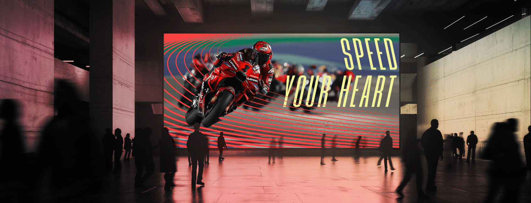
The graphic concept developed by Jaime Vallhonrat and the creative team rejects static solutions to embrace the very nature of motorsport: speed, inertia, and competitive tension.
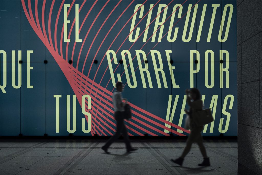
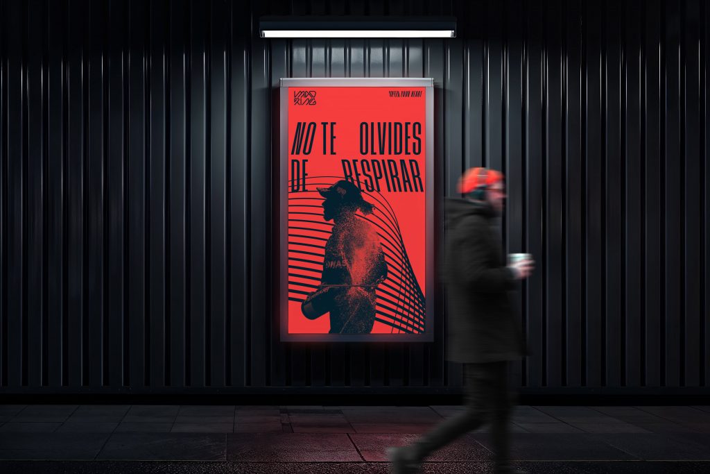
The typographic system and the brand’s visual architecture feature deliberate distortions and slanted lines that simulate the passing of the cars, the G-force at apexes, and straight-line acceleration. This is not a passive logo, but a dynamic design language engineered to create a sense of continuous motion, even on two-dimensional media.
Color architecture: passion, visibility, and context
The color palette is built around a bold red, selected for its ability to summarize competitive passion, the drive of elite racing, and the capital’s own vitality. This core shade is paired with yellow accents, an art direction decision that guarantees optimal contrast and high-impact visibility on television broadcasts while maintaining an elegant nod to the national context.
A brand system designed for the lifestyle ecosystem
The real challenge for a contemporary brand lies in its scalability. MADRING was not designed solely for circuit signage or track painting; it was conceived as a living brand with mass consumer appeal.
The visual system performs with equal strength in technical environments, official passes, race infrastructure, or safety signage, as it does when applied to merchandise, streetwear, digital platforms, and experience hubs across Fan Zones.
With MADRING, we reaffirm our vision of creativity as a lever capable of connecting cutting-edge design with major dynamics of urban and business transformation.